Case study
Zoom's Waiting Room Redesign
Redesigned the waiting room experience to reduce uncertainty, help participants prepare, and make the transitions feel calmer.
Company
Zoom
Role
Product Design Intern
Timeline
2 months
Team
Product manager, engineers, UX writer, UX manager
01
Context
The waiting room was a security checkpoint, but participants experienced it as an ambiguous pause.
Zoom Rooms let hosts control when participants entered a meeting. The feature mattered because it protected meetings, but the participant-side experience was sparse: people were asked to wait with little confirmation, limited context, and a sudden transition into the live room.

Live meeting
The meeting itself was rich with visible people, controls, and shared context.

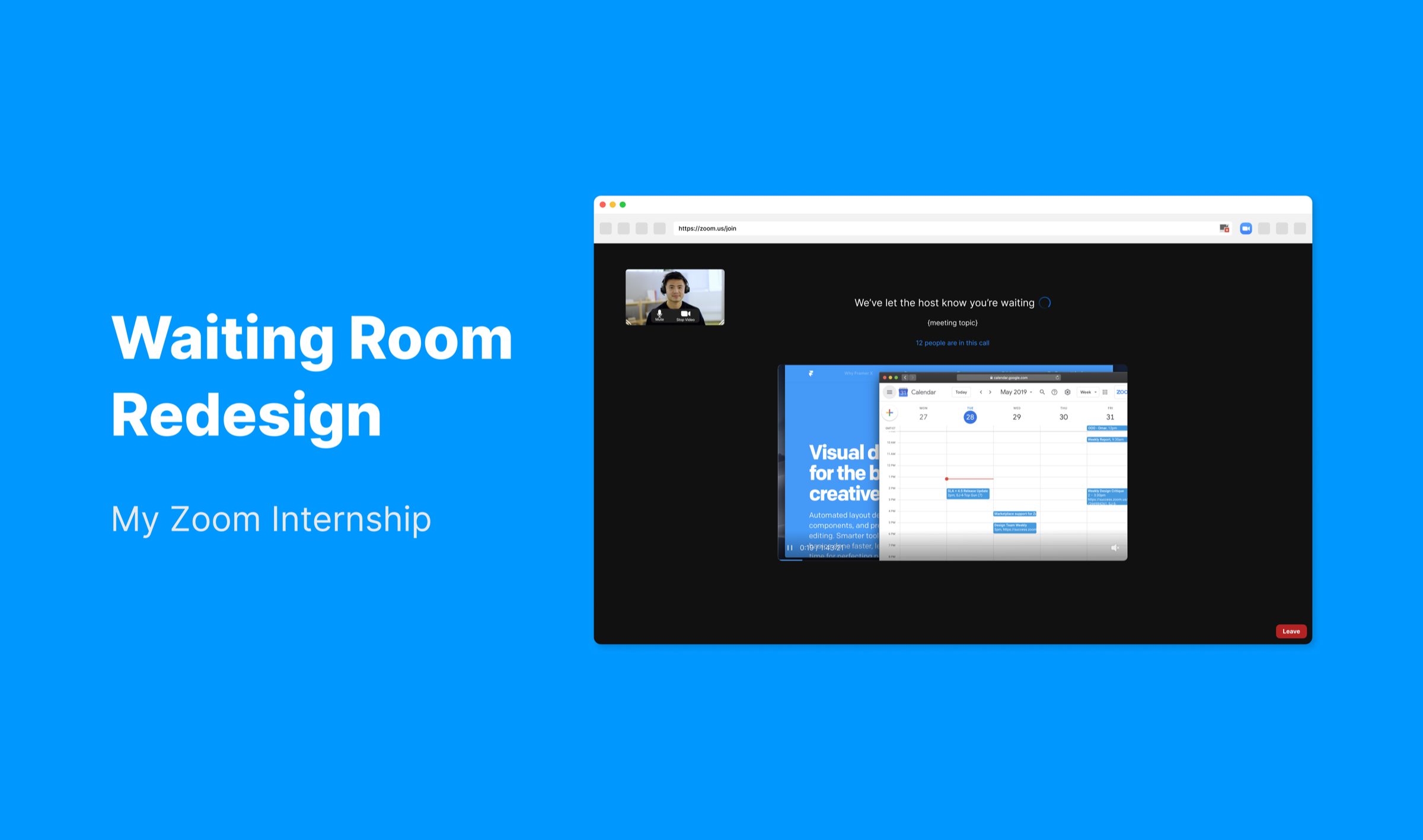
Original waiting state
The waiting room was mostly empty, making the gap between waiting and joining feel abrupt.
02
Research
I reframed the problem around uncertainty, readiness, and transition quality.
The brief started broadly: improve a frustrating waiting state. I tested the existing flow with seven current Zoom users, reviewed social and app-store feedback, compared competitor meeting tools, and mapped the waiting journey with product and engineering partners.
User signal
The waiting room left participants guessing what the system knew.
In usability sessions, participants repeatedly checked whether they were in the correct room, whether the host had seen them, and whether their setup would work once admitted. The strongest signal was not boredom alone, but a lack of system feedback during a moment when people needed reassurance.

Research synthesis
Interview notes clustered around uncertainty, preparation, interaction, and the abrupt transition into the live room.
Pattern scan
Competitors suggested that waiting could carry lightweight orientation without becoming a meeting.
Looking across Google Meet, Microsoft Teams, Webex, and Lark helped separate baseline expectations from Zoom-specific opportunities. Video preview, clearer status language, and participant context appeared as common ways to make the pre-meeting moment feel more legible.

Competitor analysis
The comparison clarified which patterns were table stakes and where Zoom's host customization model could become an advantage.
Journey synthesis
The design opportunity lived in three moments: entering, waiting, and being admitted.
Mapping the journey made the problem more operational. Before entry, people needed confidence they were in the right place. During the wait, they needed useful status and preparation cues. At admission, they needed a less abrupt handoff into a live meeting.


Journey map
The journey map converted scattered research findings into concrete moments the redesign needed to support.
03
Design
The redesign made waiting more informative without turning it into another meeting room.
Instead of filling the page with decoration, the design focused on functional reassurance: visible self-preview, clearer wording, optional room context, useful shared content, and a more controlled admission moment.

Final direction
The waiting room became a preparation space: participants could check their setup, understand status, and review relevant meeting material.
Waiting modes
Support both default and host-customized waiting rooms.
The redesigned waiting room needed to work even when a host did nothing, while still giving hosts room to add useful context when the meeting called for it. I treated customization as an optional layer on top of a clearer default state, rather than as the thing that made the experience usable.

Default waiting room
When the host does not customize the room, participants still see a calmer default state with setup visibility.

Customized waiting room
When the host customizes the room, added content can make the wait feel more intentional and meeting-specific.
Visibility
Clarify where participants are without exposing more than necessary.
Research showed that people worried about whether they were in the right room and whether anyone knew they were there. The redesign introduced room context, but kept that information configurable so hosts could decide when participant visibility was appropriate.

Room context
A small status line helps participants confirm the room is active.

Host control
The visibility decision stays with the host rather than becoming a default exposure.
Shared content
Use content only when it helps the wait feel intentional.
The waiting room did not need to become a content surface by default. But for classes, webinars, or planned sessions, lightweight shared material could make the wait feel purposeful instead of empty.

Slides
Hosts could share material that prepares participants for the session.

Website preview
The same structure supports other formats without changing the waiting model.
Admission
Soften the jump from waiting into a live room.
The final admission moment gave participants a short, explicit confirmation before they entered. It made the transition feel less abrupt while still keeping the meeting flow moving.

Admission moment
A confirmation state lets participants enter intentionally instead of being dropped into the meeting unexpectedly.
04
Outcomes
The work clarified a small but high-frequency moment in the meeting workflow.
Feedback on the prototype pointed to a smoother transition and a stronger sense of preparedness while waiting. The most useful lesson was not that every waiting room needs more content; it was that participants need enough system feedback to trust what is happening.
As an internship project, the work also shaped how I approached ambiguity: start with the real behavior, share early concepts with partners, and treat research artifacts as tools for alignment rather than portfolio deliverables.